As promised, here I'm going to take a look at the new 'KDE 4 Remix' version of Kubuntu.
For the uninitiated, let me explain. The latest version of the KDE variant of Ubuntu, has two versions - the standard disc featuring KDE 3.5.9, and this KDE 4 Remix disc, which features the new KDE 4.0 release.
In this review, I'm going to focus on this distro from the user's perspective. There's plenty of cool stuff under the hood of KDE 4, but here, I'll focus on what you can actually see and play with, as that's what will probably sway people to using this release or the official one.
So, without further ado, let's load up the KDE 4 Remix disc.
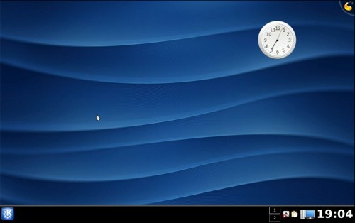
Once you've gone through with the installation process, which is virtually identical to that of the standard KDE 3 disc, you get greeted with the Kubuntu KDE4 desktop.
It features an attractive blue abstract desktop background, with the black KDE bar running across the bottom. The K menu is obvious and clear, and therefore should be very simple to pick up if you've ever used KDE before. More on the K menu later, however.
The KDE 4 spin of Kubuntu apparently lacks overt Kubuntu branding and from the user's perspective looks like a stock copy of KDE 4 without modifications.
One of the first things you may notice is this weird looking icon in the top right.

Hovering over it reveals an option to add a new widget. KDE 4 features a new widget engine integrated into the new Plasma desktop. Right now there are only a handful, including clocks, a battery monitor, application launchers and other utilities like that. Despite being few in number, the widgets are attractive and functional.
Unfortunately, not all widgets that were compatible with KDE 3's SuperKaramba application work with the new system at the current stage. Aside from this, KDE 4's widget system is solid, if lacking in variety at the current time.

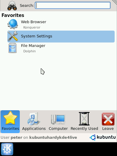
The K menu is KDE's central location for starting applications, much akin to Windows' Start menu. Previous editions of KDE have had a simple scrolling menu with application categories that then expand to allow the user to launch individual applications. There was access to other items, like settings, but it was more of an afterthought.
The new K menu has been reworked and now features several categories across a bar at the bottom. The Favourites bar records the items you use from the menu most frequently, and allows for easy access to your favourite things.
The Applications category works more in the traditional K menu style, but adopts a Vista-style scrolling system rather than cascading submenus out all over the screen. This makes it a lot clearer and keeps everything in one place.
The Computer category offers access to system settings and common places, while obviously the Recent category and Leave category do pretty much what they say on the tin.
Overall, I'm a fan of the new menu. Admittedly it will take some adaptation for me personally, when I do switch to KDE 4 full-time, but then I'm not a big user of the menu anyway, tending to plump for icons on the bar to launch apps, or using Alt-F2.

One of the big new things that the user will notice is a visual refresh. A new icon theme, called Oxygen, features in this release. From what I've seen, Oxygen looks professional and clean in the new interface, and most certainly a welcoming change from the Crystal icon set which has been around for a long time in KDE 3.
There's also a new control style and window decoration style for the release. The controls look modern and fresh, but I can't say I am a fan of the new window decoration. By default, there is a serious lack of contrast between the active window and the inactive window.

I find this disappointing, as it detracts significantly from KDE's usability. Previously, the default window decoration had a good contrast between active and inactive, so this feels like a step backwards.
Admittedly, it's a trivial detail to change to something better, however you lose the sense of visual consistency across the new platform.
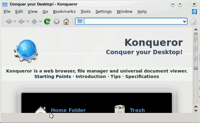
While many of the applications have been updated to use the new functionality in the KDE 4 platform, some older, KDE 3 applications remain. KDE 3 apps fit in well with the rest of the system. There are no visual inconsistencies with the theme, as it all runs on top of the same Qt toolkit.
I couldn't really find anything that rough around the edges to be honest. What needs to happen now is for the distros to make the migration over to KDE 4 full-time, and then applications can follow suit and start taking advantage of the new underlying technology that 4 brings to the table.
Conclusion
The Kubuntu KDE4 Live spin gives you the benefit of using the new KDE 4 desktop environment in a relatively stable, tried-and-tested Ubuntu system. While it is a shame that KDE 4 couldn't make it to the official Kubuntu release, that is planned for Intrepid Ibex, perhaps this does give KDE application developers a clear signal that v4 is coming, and will hit the major distros soon.
In my time playing with this disc, I had no major problems at all. Aside from my minor annoyances with some elements of the theme, KDE 4 provides that new backend technology that application developers can use to build extremely rich applications, but also giving a new smooth visual refresh to convince users to upgrade.
For the moment, I am going to stick with the KDE 3 version of Kubuntu for my main desktop. This isn't particularly because I think the KDE 4 spin won't cut it, but more down to pragmatism (and/or laziness), as I already have the KDE 3 version up and running and right now, it serves my needs well enough.
The KDE team face a unique challenge. They need to get KDE 4 working to a level where distros ship it by default. Until that happens, there won't be a sufficient base of users to justify application developers making the jump over to the new frameworks, and therefore KDE 4 won't have enough shiny new toys. This Kubuntu implementation sends out a clear message, though - KDE 4 is coming, and it works pretty damn well.
