 The style of Ubuntu releases has varied throughout the releases, with some differing radically from others and the rest continuing to build the style. But where do all of the art and style ideas come from? We talked with Kenneth Wimer of the Ubuntu Art Team to find out.
FOSSwire: Are there any major changes to the default theme/artwork in 8.04?
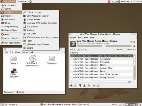
Wimer: As an LTS release it was decided that 8.04 would be the end of one "artwork cycle" which means that more radical changes are expected in 8.10. The most notable things that changed are GDM (more an artwork refresh than a redesign) and the desktop wallpaper. The Ubuntulooks, Murrine and Clearlooks Human themes that we included support the color-picker GUI which should make some people happy. Of course, there are lots of smaller pieces which we are constantly improving on which go somewhat unnoticed.
FOSSwire: In a nutshell: How does the art team work together?
Wimer: Collaboration itself takes place on the mailing list, wiki as well as on IRC. Also, any Ubuntu project wouldn't be possible without Launchpad. Community members submit their artwork and ideas, whether it be on the default Ubuntu theme or their own themes. Members are encouraged to pursue their own themes for Ubuntu, something I would like to see more of in the future. Art direction for the default Ubuntu theme is decided by Canonical, represented in this case by myself. After the basic ideas are decided we work on fleshing out the theme as a whole, piece by piece.
It is important to note that we are trying to move to a more long-term approach. Throughout the 8.04 (Hardy Heron) cycle we have also worked towards defining an art direction for the next several releases. Naturally, the goals set today will be improved upon as we steer through the process of implementation over several releases so it really becomes an evolution of a set of ideas with the final goal coming to fruition hopefully by the next LTS release.
FOSSwire: The decision to keep the standard "ubuntulooks" engine for Hardy instead of the proposed Murrine engine met with mixed reactions. Why was the decision made to keep the current style?
Wimer: There were several elements of Ubuntulooks which simply look better. The Ubuntulooks style is unique in things like the progress bars and scrollbars and no other theme said "Ubuntu" better than what we already had. We tested out both Murrine and Clearlooks and Murrine is now in the default install as well as a Human theme for both Murrine and Clearlooks so anyone who wants it doesn't have to go far to get it. Ubuntulooks is getting old and unmaintained and has several known bugs. In the long term I think we will work towards using another theme.

FOSSwire: We've seen Murrine on GNOME as well as XFCE. Is there any plan to bring the look to KDE, or will each environment retain its uniqueness?
Wimer: The idea of having both Kubuntu and Ubuntu use the same theming has come up several times over the years. I understand the logic behind the idea - it would be nice to have all apps on one desktop look the same, no matter which toolkit an app uses. However, the two projects, in and of themselves, are quite different. Just look at the logos and colors. Beyond that, the differences between KDE and GNOME at the UI and themeing level present a real obstacle.
FOSSwire: Is there anything you wish the team could have done given more time?
Wimer: (sings "We've got a long way to go and a short time to get there")
Always wishing you had a few more days is the consequence of a short development cycle. More than anything else I would like to see the team itself grow and and become more effective.
FOSSwire: What do you envision 8.10's theme as?
Wimer: Something new. We have a lot of ideas. Figuring out which ones are realizable in which time frame and moving forward is the task at hand.

FOSSwire: We've seen the base color scheme for Ubuntu change from brown, to caramel, to orange over the years. Are there plans to alter it any more?
Wimer: I think that we are slowly moving back from orange into the caramel and browns. One issue that has come up is that there is too much orange. Orange in itself is a color often used in warnings, etc.
FOSSwire: What's the best way for people to get involved with the art team?
Wimer: Stop by the wiki page, join the mailing list or pop by IRC (#ubuntu-artwork on freenode).
Any artists looking for something to do should definitely check us out. :-)