Recently, Novell have been doing quite a lot in the way of customising Linux desktop environments to fit their distributions. In SUSE Linux Enterprise Desktop (SLED) 10, they replaced the traditional GNOME Applications / Places / System trio with a single Computer button at the bottom left (much like the Start button).
In OpenSUSE 10.2, this change has made its way out of the enterprise distribution and into the community edition, but Novell have also done some work on the KDE menu system, and I'm going to take a look at the changes they've made on the KDE side of things here.
At first glance, the new button looks simply like a normal 'K menu' button, just with a facelift. The real changes are in the menu that pops out on the click of the button.
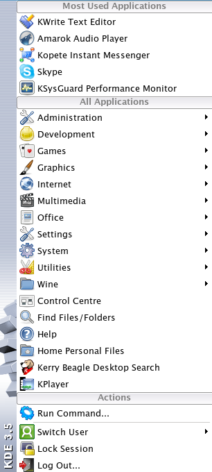
For reference, let's take a quick look at what a normal K menu looks like:
So here is the new menu:
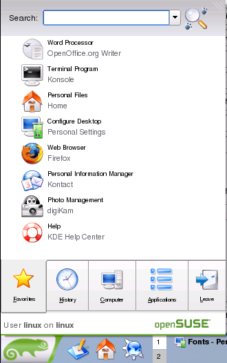
The new tabs
The new SUSE K menu sports five different tabs at the bottom. Selecting a tab changes the nature of the content that appears in the menu.
- Favourites: this is the default tab, and shows you recently used, and often used applications - a bit like XP or Vista's Start menu.
- History: history focuses on the recent, showing both recently used applications and recently edited documents.
- Computer: sort of a pseudo-My Computer interface, the Computer tab links to any mounted devices like CD-ROMs and also gives access to the home folder and system configuration programs.
- Applications: shows the traditional list of applications that the normal K menu offers.
- Leave: logoff, shutdown etc.
There is also a neat (but perhaps slightly Vista-inspired) search box inside the menu.
My thoughts
I like the idea of the new K menu, but there are some things I just can't get on with.
For example, to switch between tabs, you only need to hover over them instead of clicking them. It's a nice idea, but it means I found myself constantly accidentally activating tabs I didn't want while sweeping the mouse up to access a menu item.
The text also appears far too small. I'm pretty sure this is configurable, but in OpenSUSE 10.2 at least, it seemed unreadable.
I definitely do like the idea of the new K menu and I'm all for modernising the look of KDE and keeping it up-to-date. At the moment, though, I'm not sure that Novell's execution of the idea is quite right yet. It's almost there, but there are enough minor issues that put me off it for the time being.
